Sunday, 22 February 2009

Creating my Double page spread

To begin my double page spread I had already thought of the sort of the pattern I wanted to do and had taken pictures for it accordingly, the elements I wanted to include was the model staring back at themselves with a different look, this would make a good suggestive image of what the article included would be about. I had my model stand behind a specific back ground so make editing easier. I then had him face one way with a hat on and then the other way with the hat off.


Using editing software(Photoshop) I made a blank canvas and dragged both pictures on and aligned them up into the position I wanted them to be in. With this done the shading was a little off at the part the pictures joined. I started to use a fix tool to blend the pictures together when I had an idea to have a third picture lightly overlaid on top of the other two pictures, exclusively on the skin and between the cap between faces. This would give the finished picture a symbolisation of what the transition between the opposing faces was about.


The product after editing.


I then placed a mock up of text on top of the picture to give myself an idea of how to best place the article, while still allowing for the picture to be seen clearly , here is an example below.


The final layout of my double page spread I decided to make its slightly abstract and appealing to the reader. I used the magazines color scheme of black and white for the heading and questions but made the answers in lime green/pale yellow for them to contrast with the back ground and stand out. The color and layout used also prevents the page from being boring as they are not all just of the same style and placing, compared to a basic text area. I used different custom fonts for the the title questions and answers. Towards the bottom I ran into difficulties with the text being easy to read so I changed the text to black.

Creating Contents page


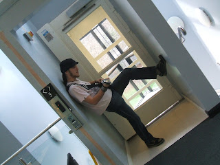
First of all I looked at the selection of pictures I had available I decided to edit this one as it was a very tall shot and would be perfect for what I had in mind. I used Photoshop to extract the model from the background, this was done via tools such as the brush, magic wand and clone stamp plus a Variety of other small tweaks.


Here I edited the image in finer detail to make a clean edited image to be used on the contents page, this was done by using the magnifying glass and a low opacity brush.


I now had the image ready to go to be used with other images and designs to contribute to the overall look of the contents page.


I started to flesh out my contents page by placing my large model image to the side and adding downsized pictures of a musical gig I had attended and taken pictures of, I tried out various positions but gave it a quirky Tetris pattern. The images where in layers so I used a pattern on a Photoshop brush to connect the pictures together, the majority of the pattern is hidden behind the pictures and takes the shape of a star I alternated the sides of the star on each adjoining picture so it would give a subtle message these musicians are "stars" The color I chose was red as it contrasted nicely with the white background


Finally I used an alternate font fitting the style of my magazine. The title was placed by itself in in large bold writing, with a logo next to it. The musicians had there names in alternate text at random positions next to there picture for it to be easy to see the picture and give it a care free look.The last touch i did was add a Small border around the page.


Similar to the case of the dis functional original front page, I decided that the contents page could use a revamp. A fundamental flaw I had discovered within my original contents page is that it listed only 7 pages and so would not qualify for a full contents page. When creating my second contents page I added the necessary photos in a building block style along the side of the page with the artists names at a tilt next to each picture to give it a modern look. The colors used (apart from the pictures) conform to the magazines new color scheme of whites, blacks and greys mainly. Finally I added a custom title and a list of the contents within my magazine.

Creating my front cover


When creating my front cover, I came up with various concepts, and the one shown above had the most merit, I really wanted to use the angle of pictures to run onto each other, as this would make for a very interesting and unique take on a front page. I also made room for details to be added, such as price, barcode and inside news.


After I had taken my pictures, I experimented with them in photoshop to see which pictures would work for my desired result. After a time I had my final pictures selected, and started to arrange them on a canvas to build up my front page. Some image manipulation was done for the center of the page so that the images would meld together, yet still be separate.


I used a specialist website called Dafont, that allowed me to a range of special fonts that where not standard, here I had a wide choice of what I would like and what style. Above are some examples of the range available


As shown above the magazine cover had come together, I had added a barcode and a font to the arrangement of pictures. The font being placed on the Canvas ran into difficulty's so I had to manually edit some parts of it, but the end result was satisfactory.


Using extra tools I added the finishing touches to my magazine, this included boxes for information within the magazine and various other text, for example price, issue number and date. And finally a border.


The original front page I created, this design would eventually be replaced with the front page you will see below.


The picture chosen for my second attempt at a front page.


After some consideration when re-capping on the work I had done for my project I came to the conclusion that the original front cover was unacceptable as a front cover using the components used for creating a successful,I included to many images and the text was hard to read. With this is mind I set about re-designing my front page to give it a better new look.


Instead of using many pictures I focused on placing a single picture in the center of the page. To make the title easily definable I used black to contrast with the pale blue back ground and white when the back ground grew to be darker. I also did this for the sub heading. I added clear information on what was in the magazine along with a barcode, price, date and issue number. I also added a plug stating the interview. Overall I think this version of the front page is a vast improvement compared to my original

Picture for my Magazine


Creating/Planning my music magazine

Here I will explain how I am going to set about planning my music magazine. First of all I decided what type of genre the magazine would be. I settled on a rock/ alternativie magazine taking inspiration from some of the more successful magazines of this type. To help me plan this I will use the acronym LIIAR

Language
My magazine is aimed at teenagers to young adults so I will be using quite modern launguage and words, although I will keep it quite witty and informative. Taking this approach it will appeal to a larger portion of the audience I will be trying to attract.

Ideology
The aim of the magazine is to promote upcoming muscians of the genre and highlight some of the more out of the ordinary styles. It would also be informative on a wide range of music related content of the genre to help intergrate the audience.

Institution
I did research into the most successful/influential media production companies, after some consideration I setteled on IPC media, as they have under there name magazines that are similar to the one I am wanting to create.

Audience
The audience I am trying to attract is 15 to 25 year olds. The magazine will hopefully have styles and content to cater for the younger end of the age group and the older end at the same time, this will mean the magazine will have to be easy to read and interesting to look at.

Representation
The magazine as mentioned will have to be suitable for young teens up to young adults. I think for the overall look of it, it should have a simple lay out yet look very interesting to draw in readers. I also want to represent the music I have chosen to base the magazine on, and help the viewer relate and feel a part of what they read.

The color choice for the front page and contents page use very contrasting colors at part to give it an individual look, while the doublepage spread is a much lighter gentle tone as this is about someone personally and helps the reader feel at ease while reading about someone.

Main task, preliminary research

For the main task I have to create a music magazine front cover, contents page mock up and a double page spread. Before I set about creating this I will need to do research on other music related magazines and publishers to find out what contributes to a success full magazine.

first i will look at magazine publishing companies. I have chosen three companies that have very success full magazines. Once i have researched into each I can determine which one was the most successful and relative to my magazine.

IPC media

Taken from the site

IPC Media is a leading UK consumer magazine publisher. Almost two in every three UK women and over 44% of UK men read an IPC magazine. That's over 26 million UK adults. IPC's diverse print and digital portfolio offers something for everyone. Our 80 magazines include What's on TV, Pick Me Up, Woman, Now, Marie Claire, In Style, Woman & Home, Ideal Home, Nuts, Wallpaper*, Country Life, The Field, Rugby World, Practical Boat Owner and Look, our latest high street fashion and celebrity weekly. Our digital properties include NME.com, the third largest commercial music website in the UK and housetohome.co.uk, the UK's first homes portal. IPC's brands are very simply at the heart of the UK's cultural life

This shows that IPC Media is very diverse and has magazines for many age groups, some of the magazines are similar for what I am aiming for such as NME.

Bauer(Formally Emap Media)

Emap has produced many well known magazines both for music and other topics. An interesting thing I have found out is that they are the producers of some of the most popular rock magazines such as Kerrang! Like IPC Emap produces a wide variety of magazines that have a very large amount of the target audience they aim for.They also have a other ways to integrate there products into the music industry such as there two radio stations Kerrang! and Kiss FM.

Future Publishing

From the website

Future is the largest publisher of guitar magazines in the world and the biggest music-making publisher in the US and UK. Guitar World celebrated its 25th year in 2008 and is still the world's biggest guitar magazine. Classic Rock and Metal Hammer continued to increase their circulations in a declining music magazine market. In film, Future is the biggest publisher of magazines in the UK, distributing around 4.5 million every month. During the year, we launched new website musicradar.com and relaunched totalfilm.com.

This company has many different magazines for areas such as games, music and film. Noted above they have the worlds biggest guitar magazine.This company would be a good choice for my magazine as it features magazines such as classic rock and metal hammer, both of which are similar to what I had in mind for my magazine.

Evaluation of Magazine front cover and contents page

To evaluate my work on the front cover and contents page I will look at what steps I did to creating it.

First of all for my front cover my brief was to create a magazine front page that had a medium shot of a student, but before this I had to come up with a college based theme for the magazine, I had a few concept ideas but finally settled on a college basketball magazine.I drew up a concept for on how I wanted it to look including specific things like the masthead, border and pictures. Once I had this ready I would use it as a reference when creating the real thing. I then set about acquiring pictures for the front page, this actually turned out to be difficult to do, so I improvised using myself as the model with a basket ball. I then compared the images with my mock up, I realized I couldn't get it exactly how I wanted it so decided to make a few changes and improvements. I used Photoshop mainly to help manipulate the image and create the cover, this turned out well. If I was to do this area again I would most likely change the theme of the magazine and look into a other areas for a broader opportunity to develop my front cover.

For the contents page mock up I wanted it to be easily definable and keeping to the theme of the front cover, the main idea for this outlook is that if it came to making the real contents page I would know the necessary areas of content I would put in the page.

Contents Page


This is the mock up of my contents page for the magazine I am creating called "SMASH"
I used a combination of both word and publisher to create this depending on the availablity at the time.This mock up is of simple design as this is what my magazine is trying to convey, getting down to the point. I have used the same color scheme within the contents page as the front page to give it continuity.

If i was to do a proper contents page I would change the font to be a litle more unique and eye catching. some of the pictures I aquired from the internet to bulk it out more.

Lastly I added a coupon to the bottom as this would allow for the mock up to include an offer of some sort or maybe even an advert and increased pictures.